
Signage Brand Consistency for Florida Businesses | Paradise Signs & Graphics | Titusville, FL
Most businesses do not set out to have inconsistent signage. It happens gradually. A new sign here, an updated logo there, a vehicle wrap from one vendor and a lobby sign from another. Over time, the brand that looks sharp and unified in a marketing presentation looks scattered and unintentional in the physical world.
Brand consistency in signage is one of the most significant trends in commercial signage heading into the second half of 2026. Industry research shows that businesses with consistent visual branding across their signage systems see measurably stronger customer recognition and trust than those relying on one-off sign purchases made without a coordinating strategy. The difference is not subtle to customers, even when they cannot articulate what they are noticing.
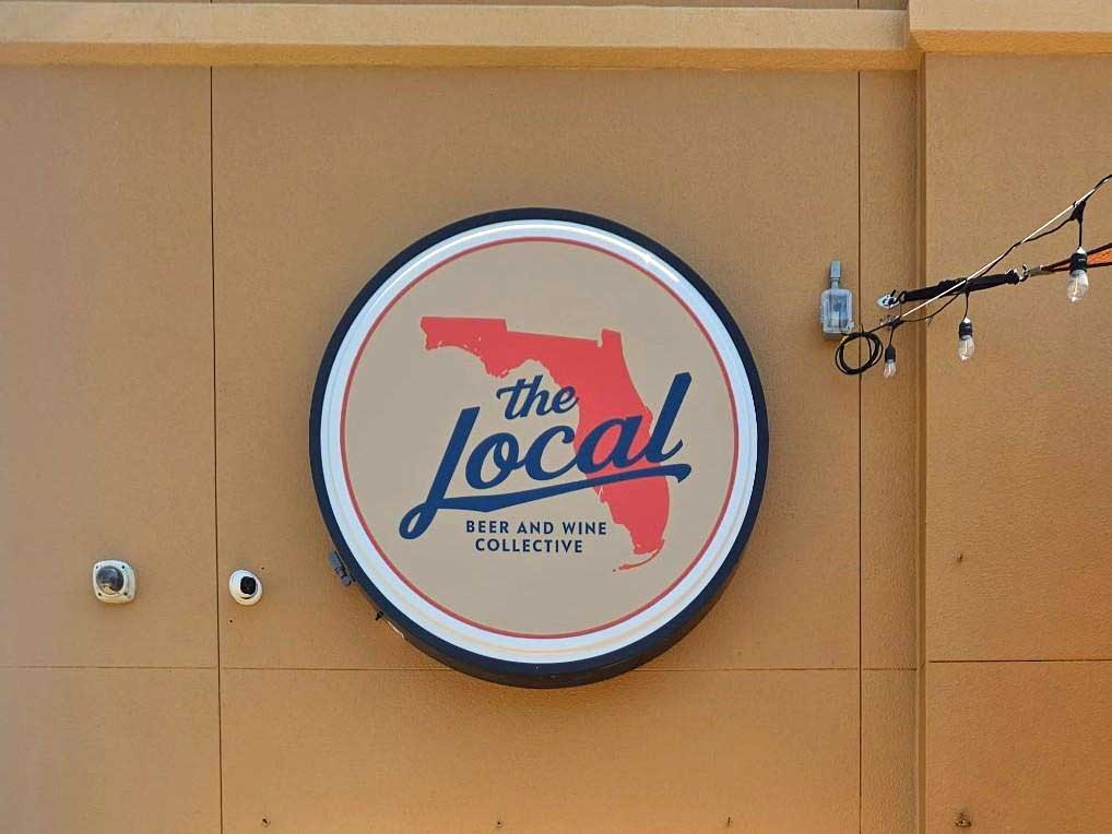
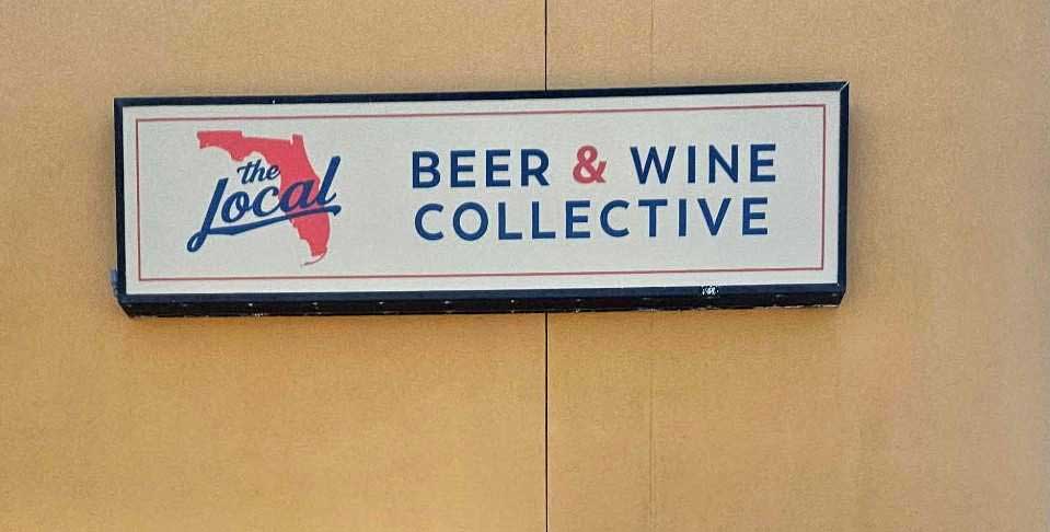
What Signage Brand Consistency Actually Means
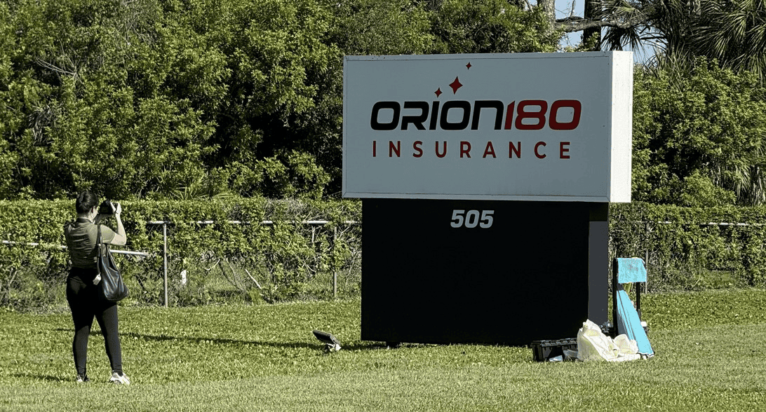
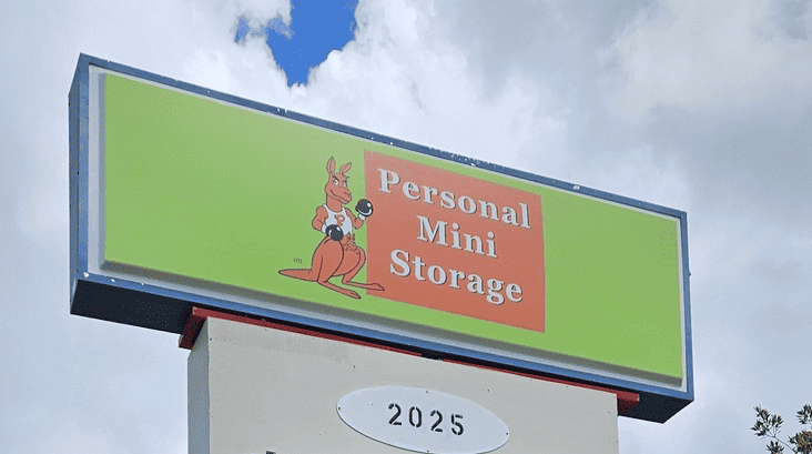
Consistency in signage means that every sign associated with your business — exterior building signs, interior lobby and wayfinding signs, vehicle graphics, window lettering, and any temporary or event signage — shares the same visual DNA. The same brand colors, produced to the same color specifications. The same fonts, at proportionally consistent sizes. The same material finish language, so that a brushed metal lobby sign and a powder-coated exterior sign look like they came from the same design intention even if they were produced separately.
This sounds straightforward until you realize how many points of failure exist in a typical small business signage history. A logo redesign that was applied to the website and business cards but never updated on the exterior sign. A vehicle wrap produced by a quick-print vendor that approximated the brand colors rather than matching them exactly. An interior sign produced years ago in a font that has since been retired from the brand standards.
None of these individual inconsistencies is catastrophic on its own. Together, they accumulate into an impression that the business is not quite as put-together as it could be. Customers pick this up, even in passing, even without being able to name what they are noticing.
Why This Matters More Than Ever in 2026
The competitive environment for local businesses has raised expectations around professionalism in physical presentation. Customers who are accustomed to highly polished digital experiences — apps, websites, social media — bring those expectations with them when they encounter a physical business. A brand that looks cohesive and intentional across every touchpoint signals that the business behind it is operating with the same level of attention to detail.
According to the International Sign Association, businesses that invest in upgraded, coordinated signage systems can see walk-in traffic increases of ten percent or more from a single well-executed improvement. When that improvement is part of a unified brand system rather than a standalone update, the cumulative effect on recognition and credibility compounds over time.
There is also a practical risk to inconsistency that most business owners do not think about until they are facing it. A business going through a rebrand, an acquisition, or a location change that has a well-documented and consistently applied signage system can execute that transition cleanly. A business whose signage history is a patchwork of vendors and vintage decisions faces a much more complicated and expensive update process.

The Signs Most Likely to Fall Out of Step
Vehicle graphics are the most common inconsistency point. Vehicles get replaced on different cycles than other branded assets. Wraps age and get updated by whoever the business is working with at that moment, which may or may not be the same partner who produced the original. Over a fleet of several vehicles over several years, color drift and logo version inconsistencies are nearly inevitable without deliberate management.
Temporary and event signage is another frequent gap. Banners, A-frame signs, and event displays often get produced under deadline pressure and from a different source than the permanent signage. They go out into the world representing the brand and then come back damaged, faded, or lost, with no record of exactly how they were produced. The next version gets produced slightly differently.
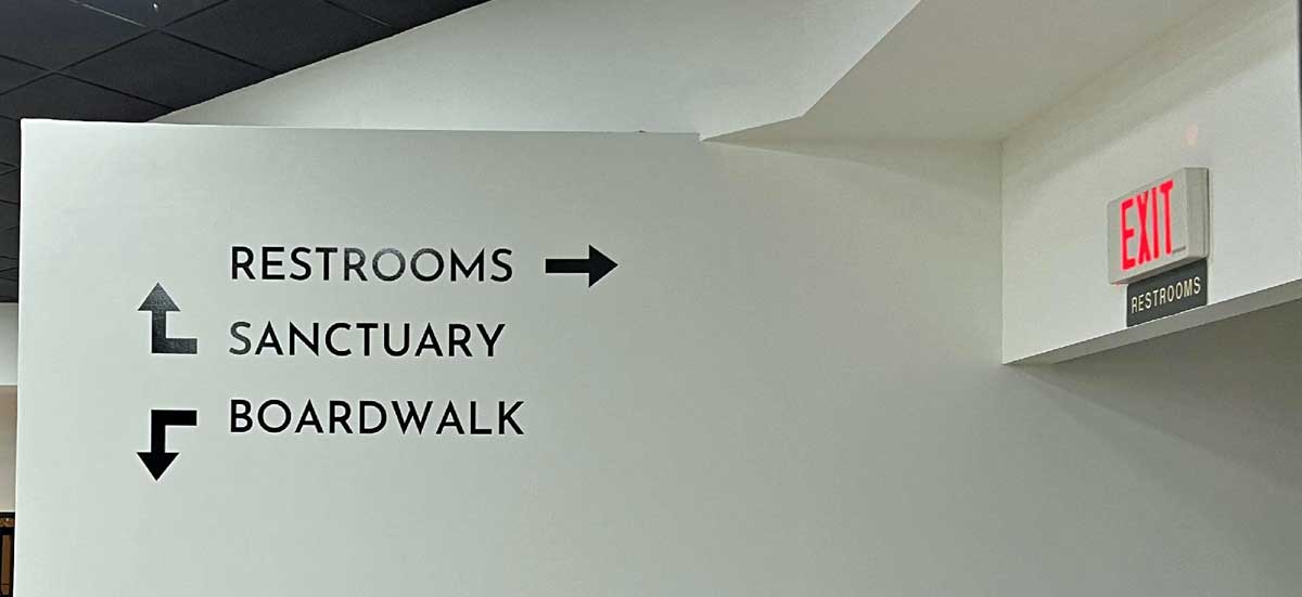
Interior directional and identification signs age in place and rarely get flagged for update the way exterior signage does. A lobby sign that was replaced after a rebrand may share a hallway with suite identification signs that predate that rebrand by five years. The mismatch is visible to every person who walks that hallway.
How to Build a Consistent Signage System
The most useful thing a business can do is create a signage inventory — a simple record of every sign associated with the business, where it is, when it was produced, who produced it, and what brand standards it was produced against. This takes time to assemble but immediately reveals where the inconsistencies are and which need attention first.
The second step is establishing clear specifications for how the brand translates to physical signage. Exact color values for sign production, which differ from screen color values. Approved fonts and the sizes at which they are used on different sign types. Material and finish standards for interior versus exterior applications. These specifications do not need to be elaborate, but they do need to exist in a form that any signage vendor can reference.
The third step is working with a signage partner who will apply those specifications consistently across every project rather than defaulting to whatever is easiest to produce. That kind of partnership, one where the vendor understands your brand and treats every new sign as part of a system rather than a standalone job, is what keeps the system coherent over time.
A Note on Color Matching Across Sign Types
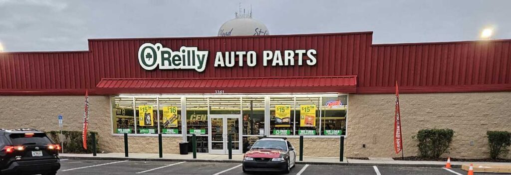
Color consistency is technically the most challenging aspect of signage brand consistency, and it is also the most visible when it goes wrong. The same brand color can print differently on vinyl, powder-coated aluminum, acrylic, and painted substrates. Without a common color reference standard and a vendor who understands how to match across materials, two signs produced to the same specification can look noticeably different side by side.
This is why professional signage partners work from established color specification systems and use material-specific calibration rather than eyeballing color matches. For businesses in Florida’s coastal environment, where UV exposure accelerates color fade at different rates on different materials, color consistency also requires choosing materials that age at similar rates so the system stays coherent over its useful life.
Contact Paradise Signs & Graphics Today:
📞 Call: 321-567-5253
📧 Email: wecare@paradisesignsandgraphics.com
🌐 Website: paradisesignsandgraphics.com
📍 Visit Us: 3650 Bobbi Ln, Suite 121-123, Titusville, FL 32780
Connect with us on social media:
Facebook | Instagram | LinkedIn