
Color Psychology in Business Signage | Paradise Signs & Graphics | Titusville, FL
Your Sign Makes a First Impression Long Before a Word is Spoken
People process color before they read words. That is not a theory or a marketing
slogan. It is how visual perception actually works. By the time a customer registers what
your sign says, they have already had a reaction to how it looks, and color is the
dominant driver of that reaction.
For business owners, this means that the color choices on your signage are doing
communication work whether you have thought carefully about them or not. As we have
covered before, — and color is the largest single driver of that impression. The
question is whether it is working for you or against you. Getting this right is not about
following a rigid formula. It is about understanding what different colors tend to
communicate and then making intentional choices that align with what your business
actually wants to say.

Why Color Works Before Words Do
Studies consistently show that color can increase brand recognition by up to 80 percent.
That number gets cited often enough that it starts to feel abstract, but the practical
implication is concrete. When a customer has seen your sign, your truck, and your
storefront multiple times, they begin to recognize your brand by its colors before they
consciously register the name. Color is the shortcut the brain uses when it has seen
something before.
This is also why color consistency matters so much across every touchpoint. A business
that uses one version of its brand color on its outdoor sign, a slightly different version on
its vehicle wrap, and something else entirely on its printed materials is fragmenting the
recognition it is trying to build. Every inconsistency slows down the process of becoming
familiar to the people in your market.
What Different Colors Tend to Communicate
Color psychology is not an exact science, and context matters. The same color reads
differently depending on the surrounding colors, the industry, the audience, and the
specific shade. That said, certain associations are consistent enough to be worth
knowing.
Blue is the most broadly trusted color in commercial signage. It communicates stability,
reliability, and professionalism. It is dominant in financial services, healthcare, and
technology for exactly that reason. For service businesses where trust is the core selling
proposition, blue is a defensible default. The specific shade makes a difference. Navy
reads as authoritative and serious. Bright blue reads as approachable and energetic.
Sky blue reads as calm and clean.
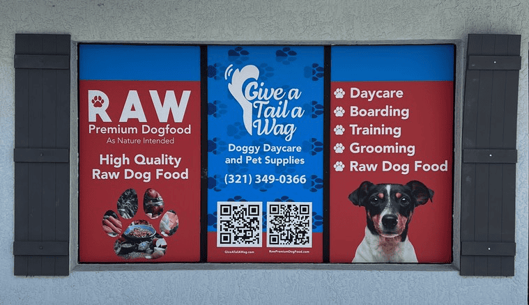
Red creates urgency and draws attention faster than almost any other color. It raises
arousal, which is useful for retail environments where you want to drive immediate
action. It is common in food service because it is also associated with appetite. The risk
with red is that it can communicate aggression or alarm if used without enough contrast
or at excessive scale. A small, confident use of red is very different from a wall of it.
Green carries associations with nature, health, and financial stability. For wellness
businesses, landscaping companies, or any brand that wants to signal environmental
values, green is doing multiple layers of work simultaneously. The specific shade
matters here as well. Bright, saturated greens can feel synthetic. Deeper, more muted
greens feel grounded and trustworthy.
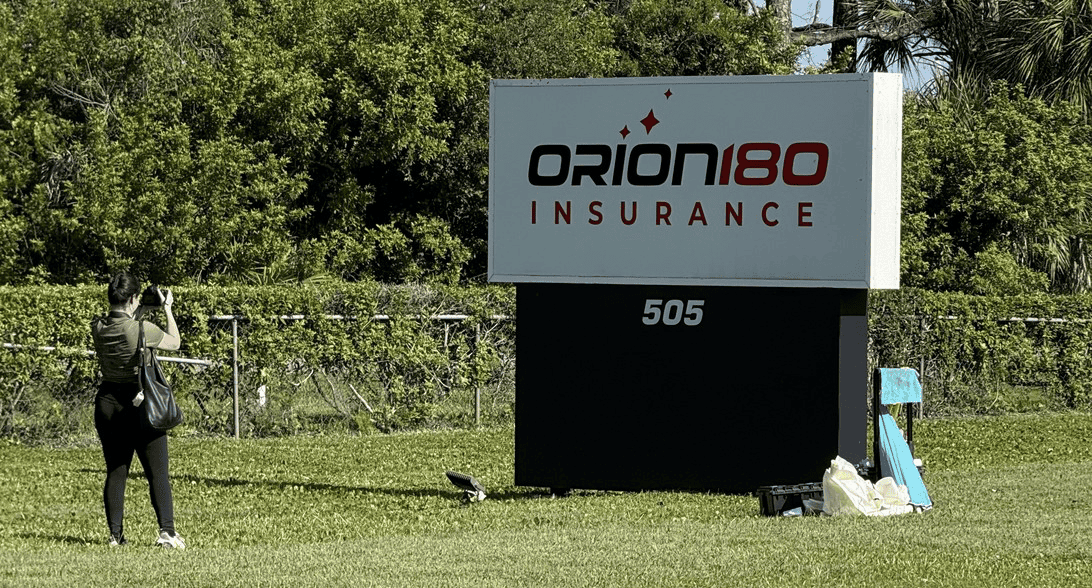
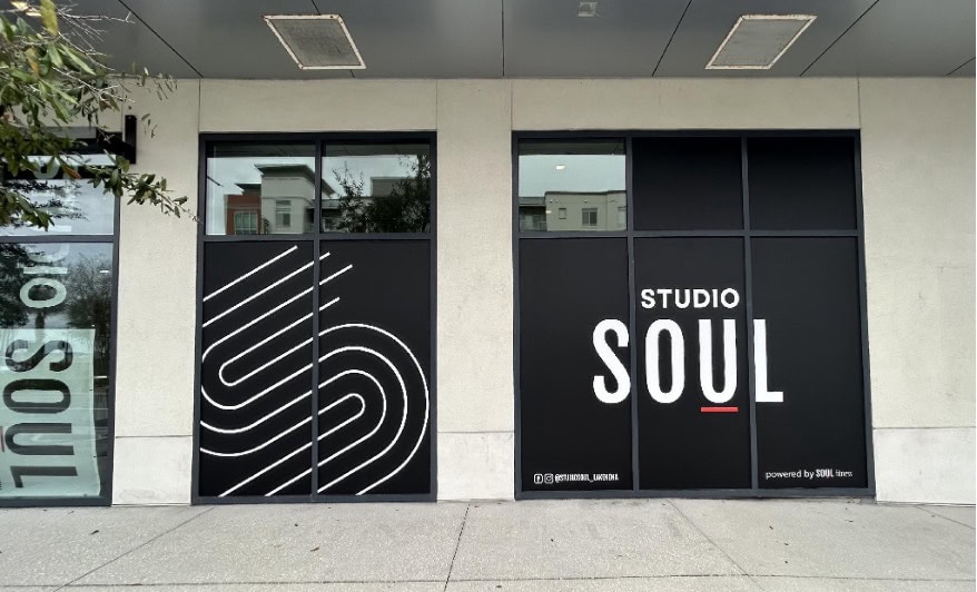
Black and dark neutrals communicate luxury, authority, and precision. High-end
service businesses, professional firms, and brands positioning themselves at the top of
their category use dark palettes because the associations with quality and restraint are
consistent across audiences. On signage, dark backgrounds with light text or metallic
elements create a premium impression that is hard to fake with cheaper materials.
Yellow and orange are visibility colors. Yellow in particular is processed by the human
eye before any other color, which is why it is used for safety signage and caution
markers. In commercial contexts, yellow and orange communicate energy, optimism,
and approachability. They are common in trades, home services, and food businesses
for those reasons. The challenge is contrast. Yellow on white is nearly invisible. Yellow
on dark backgrounds, or used as an accent against a neutral, is highly effective.

Contrast Is More Important Than Most People Realize
The color of your sign text matters as much as the color of the background, and the
relationship between the two matters more than either independently. Poor contrast is
the most common reason an otherwise well-designed sign fails to communicate at a
distance or in different lighting conditions.
The ADA contrast standard of 70 percent is a useful benchmark even for signs that do
not technically require ADA compliance — and the W3C Web Content Accessibility
Guidelines reinforce the same principle: higher contrast improves readability for people
with low vision and anyone navigating a busy visual environment. High contrast is not
just an accessibility feature. It is a readability feature. A sign that is difficult to read in
direct Florida sunlight, in the glare of an overcast day, or in the low light of early evening
is a sign that is not fully earning its place.
Dark text on a light background and light text on a dark background are both effective
when the contrast is sufficient. Medium values on medium backgrounds are where signs
disappear. If you are evaluating a sign design, look at it in different lighting conditions,
not just on a well-lit monitor in a design review.
Choosing Colors for Your Specific Business and Market
The right colors for your signage are the ones that align with what you want customers
to feel when they encounter your brand, are distinguishable from your direct competitors
in the local market, and hold up across every application from outdoor signage to
vehicle graphics to printed materials.
That last point is often overlooked. A color that looks right on a sign may shift
significantly when printed on vinyl for a vehicle wrap or reproduced on a different
substrate. Professional color management means working from consistent color
specifications — most commonly Pantone color standards — across every application.
That consistency is what makes a brand feel cohesive rather than roughly similar.
For businesses in Titusville and across the Space Coast, there is also a local context
worth considering. Coastal markets have their own visual vocabulary. Colors that feel
fresh and appropriate in a beachside environment may read differently in a suburban
commercial corridor. A signage partner who works in your market regularly has an
intuitive sense of what the visual environment looks like and where your sign needs to
stand out within it.
Make Your Color Choices Intentional
At Paradise Signs & Graphics, color is part of every design conversation from the start.
We help businesses throughout Titusville and Brevard County make sign color choices
that are grounded in how color actually works, not just how it looks in a rendering.
If you are starting a new sign project or reconsidering an existing one, we would like to
be part of that conversation early. Contact us at
wecare@paradisesignsandgraphics.com or stop by our Titusville location to talk through
what your signage should be communicating and whether your current colors are
getting you there.
Paradise Signs & Graphics | 3650 Bobbi Ln Unit 121-123, Titusville, FL 32780 | (321) 567-5253 | paradisesignsandgraphics.com